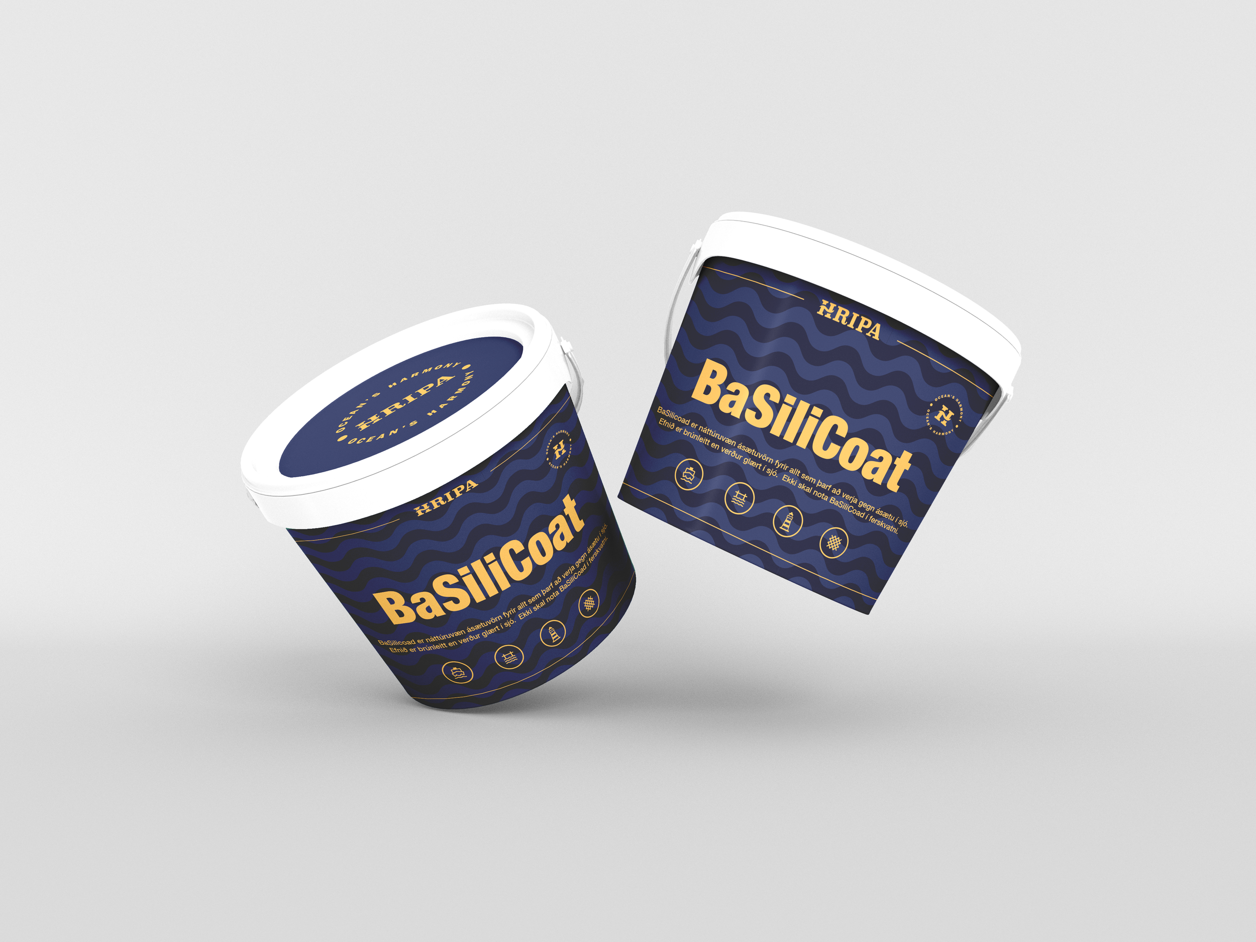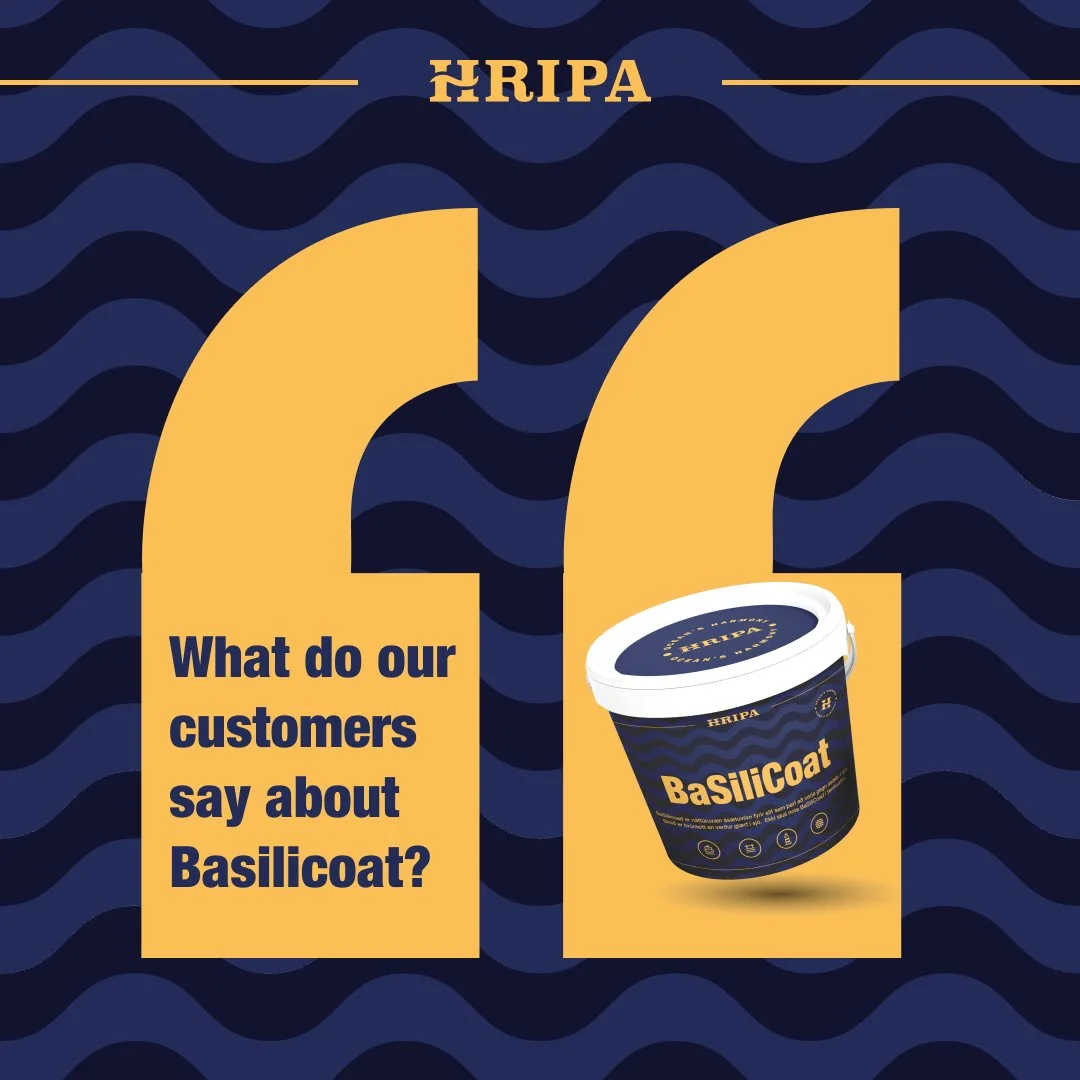
Hripa
Is a company built around a revolutionary patent protected innovation for the marine industry.
Challenge
Most conventional antifouling coatings rely on toxic biocides and heavy metals (such as copper or zinc) to prevent marine growth on hulls. While effective against fouling, these substances continuously leach into the water, harming marine ecosystems. They accumulate in sediments, disrupt the food chain, and pose long-term risks to fish, shellfish, and other aquatic organisms.
Beyond direct toxicity, traditional antifouling paints also contribute to the decline of biodiversity in coastal waters, where many boats are moored. Sensitive ecosystems, such as harbors, marinas, and shallow coastal zones, are especially vulnerable. Over time, this pollution not only damages marine life but also undermines the health of the oceans we all depend on.
The Solution
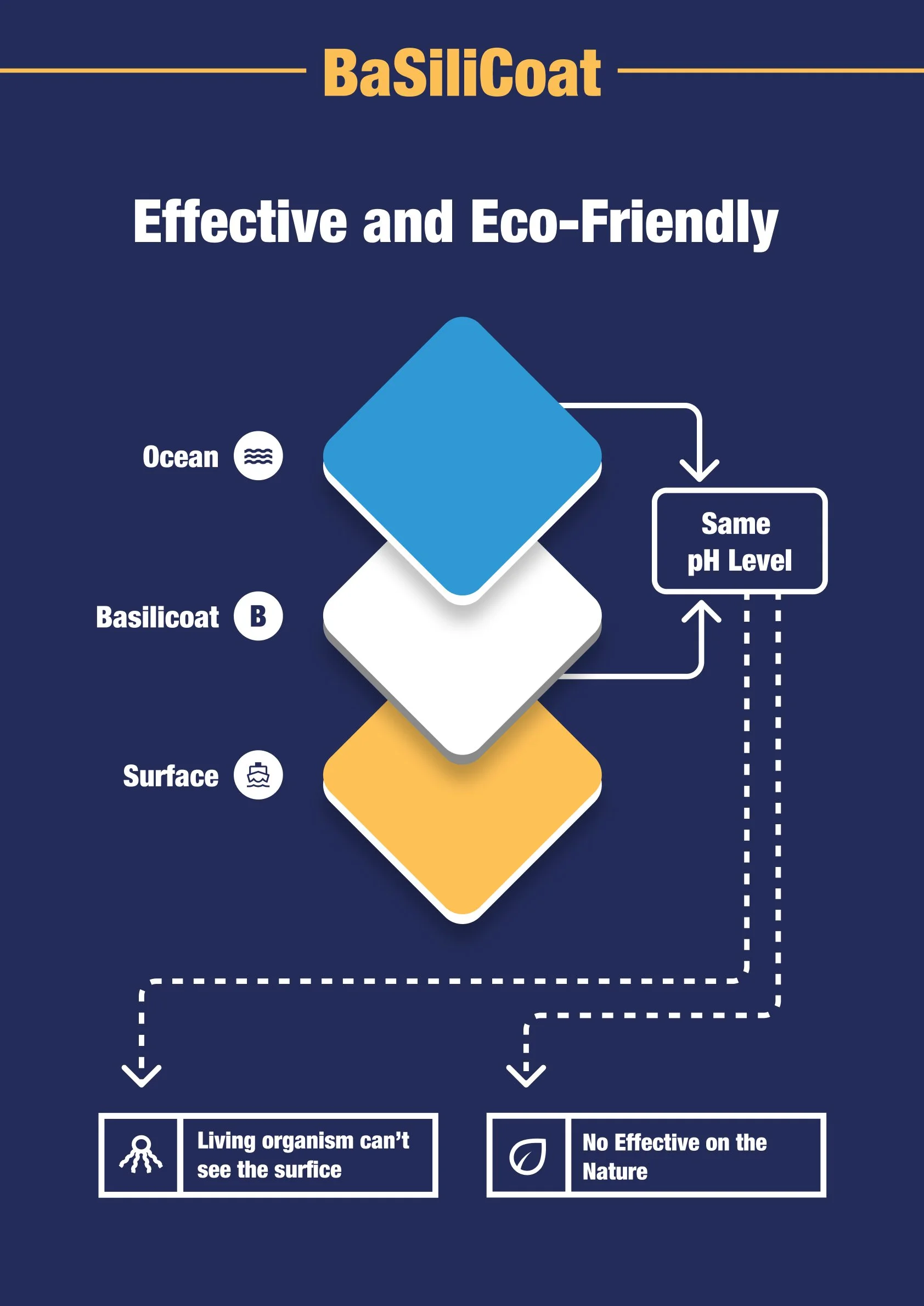
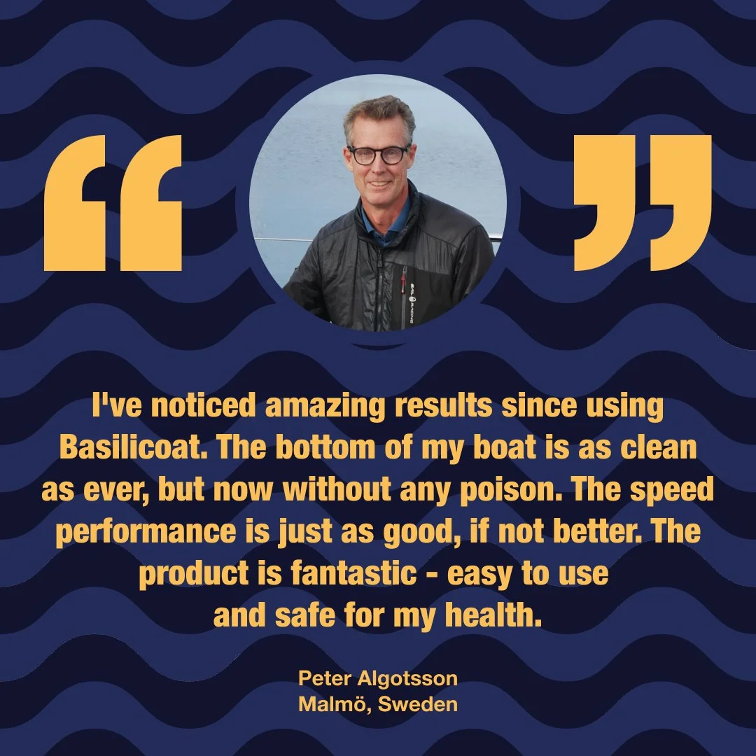
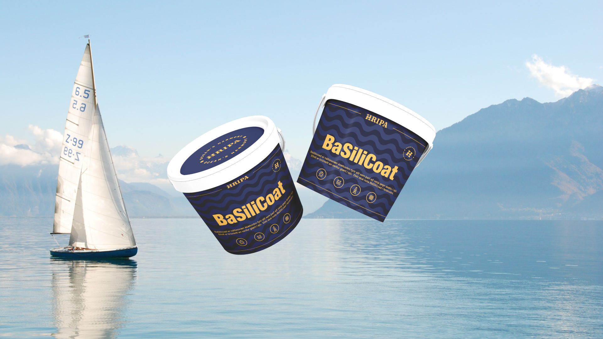
Basilicoat offers a safe and sustainable alternative to toxic antifouling paints. Instead of relying on harmful biocides or heavy metals, Basilicoat is designed to work in harmony with the ocean. Its pH balance matches that of seawater, making it invisible to marine organisms and preventing fouling naturally, without releasing pollutants into the environment.
Hreggviður Davíðsson’s patent protected innovative approach protects both boats and marine ecosystems. Basilicoat ensures strong performance and ease of use for boat owners, while safeguarding the health of our oceans for future generations. It is a proven solution, tested and trusted by boat clubs across Sweden, that shows eco-friendly innovation can outperform traditional methods.
The Visual Identity
I was offered to come into this exiting project leading the visual design and the overall branding experience
The visual identity was built around the companies purpose. We wanted all visual elements to speak the same visual voice towards sustainability, where man and man and the nature can live in better harmony.
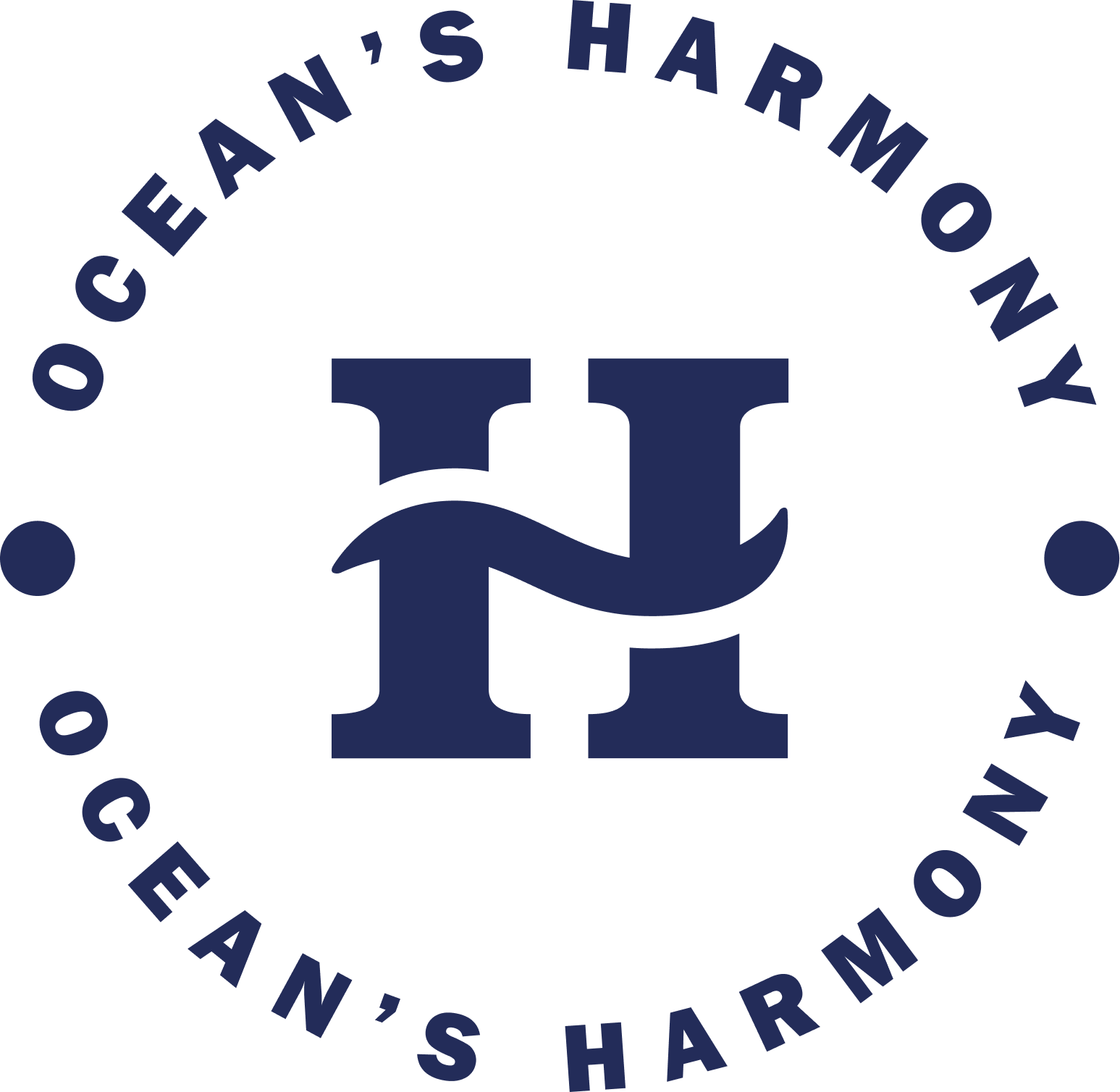
The companies slogan is “Ocean’s Harmony“
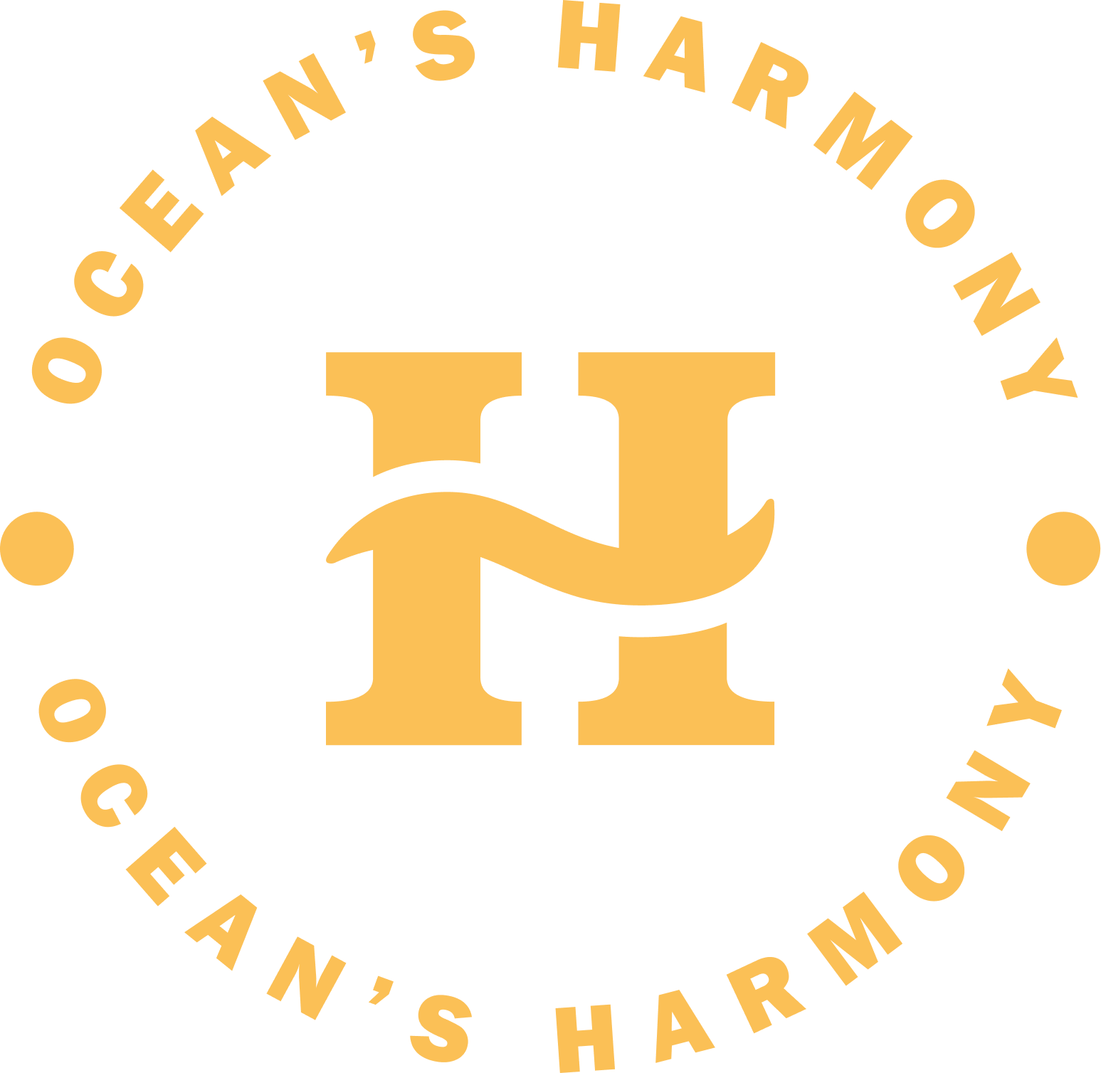
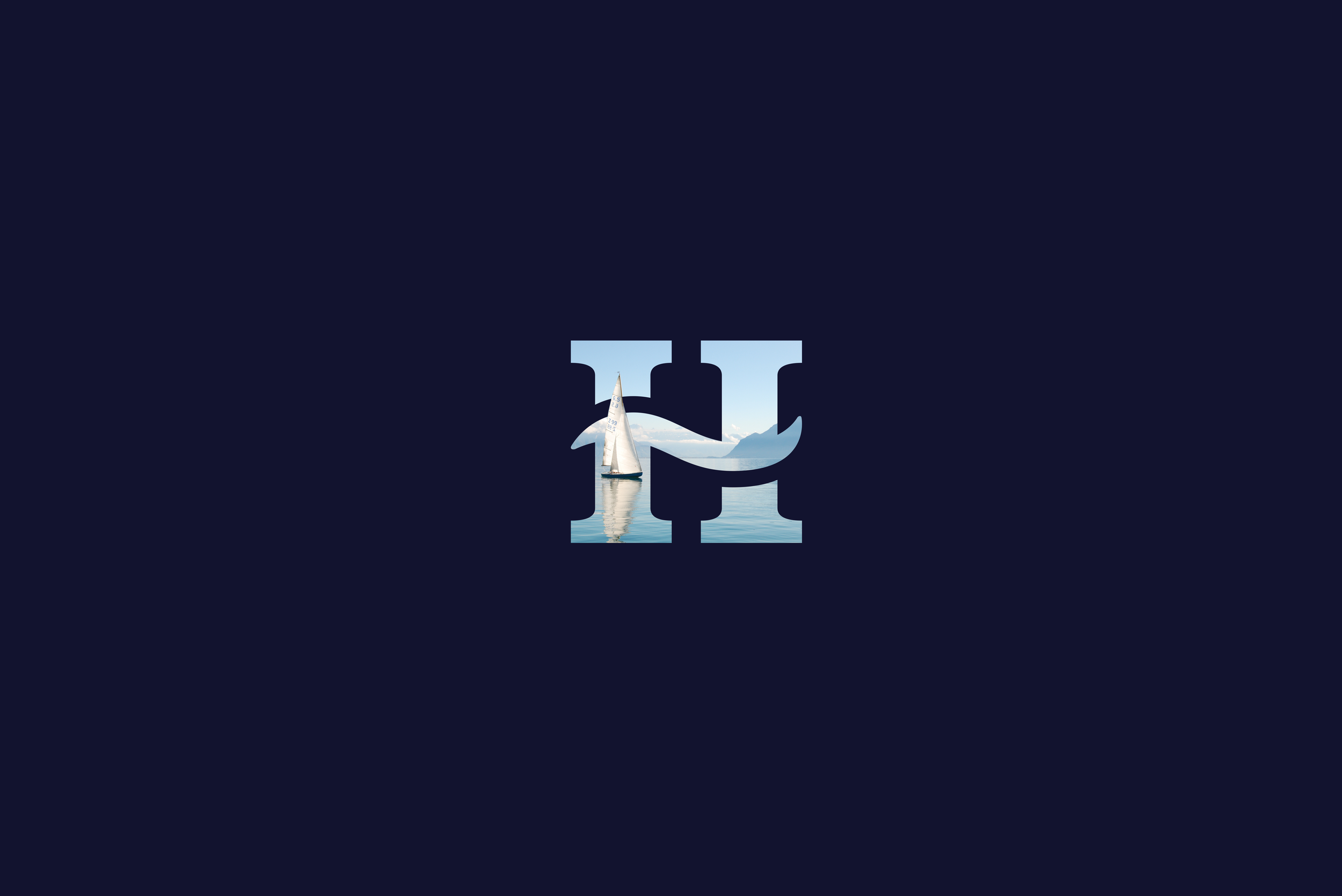
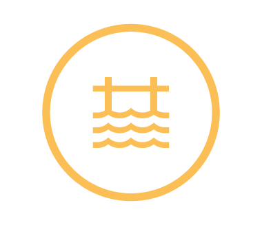
The Logo
When it came to design the companies logo we wanted it to represent.
#1 The wave is a symbol of the ocean, the largest and one of the most important elements of nature.
#2 What lies beneath the surface is hidden from most of us, yet it is always present and essential to all marine life.
#3 H is the initial of “Hripa.” The mark can be used together with the company’s name, or on its own.
#4 Returning home to a safe harbour is a symbol of stability and security. The two pillars represent the strong foundations on which the company builds its operations.


Colours
Hripa’s color palette reflects the depth of the ocean through three shades of blue, complemented by the warmth of yellow and balanced with subtle grey tones for support.


Typography
Hripa’s font family is Helvetica Neue, a timeless and versatile typeface that reflects clarity and modern design. For headlines, we use the bold and condensed versions to create impact and grab attention, while the regular style is reserved for body text to ensure readability and a clean, professional look. Together, they give our communication a consistent voice that feels both approachable and trustworthy.

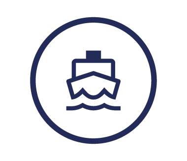
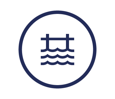
Icons
Icons are a powerful part of visual branding, they simplify complex ideas, create consistency, and make a brand instantly recognisable. When used well, they guide people, build trust, and add a touch of personality to every interaction.


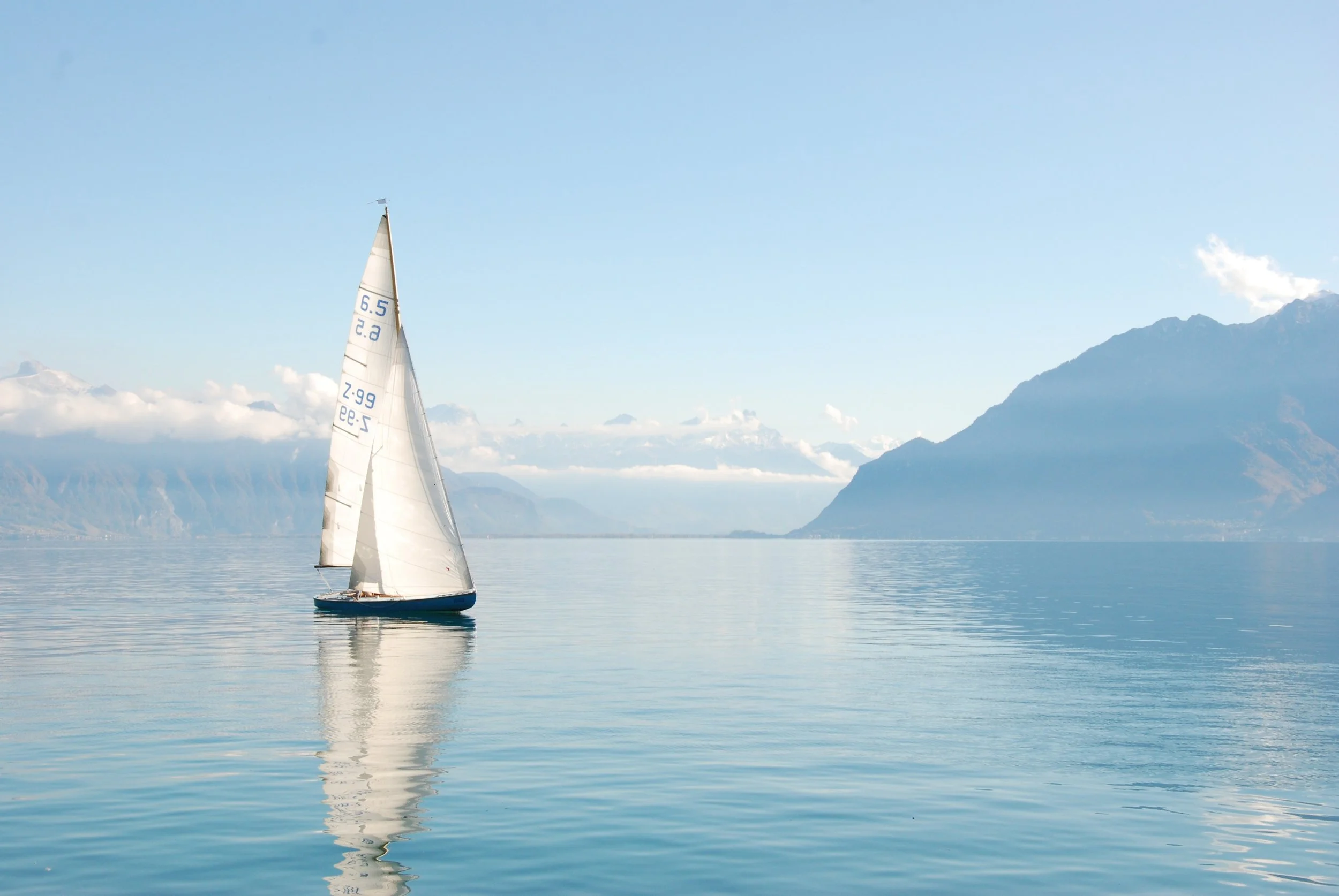
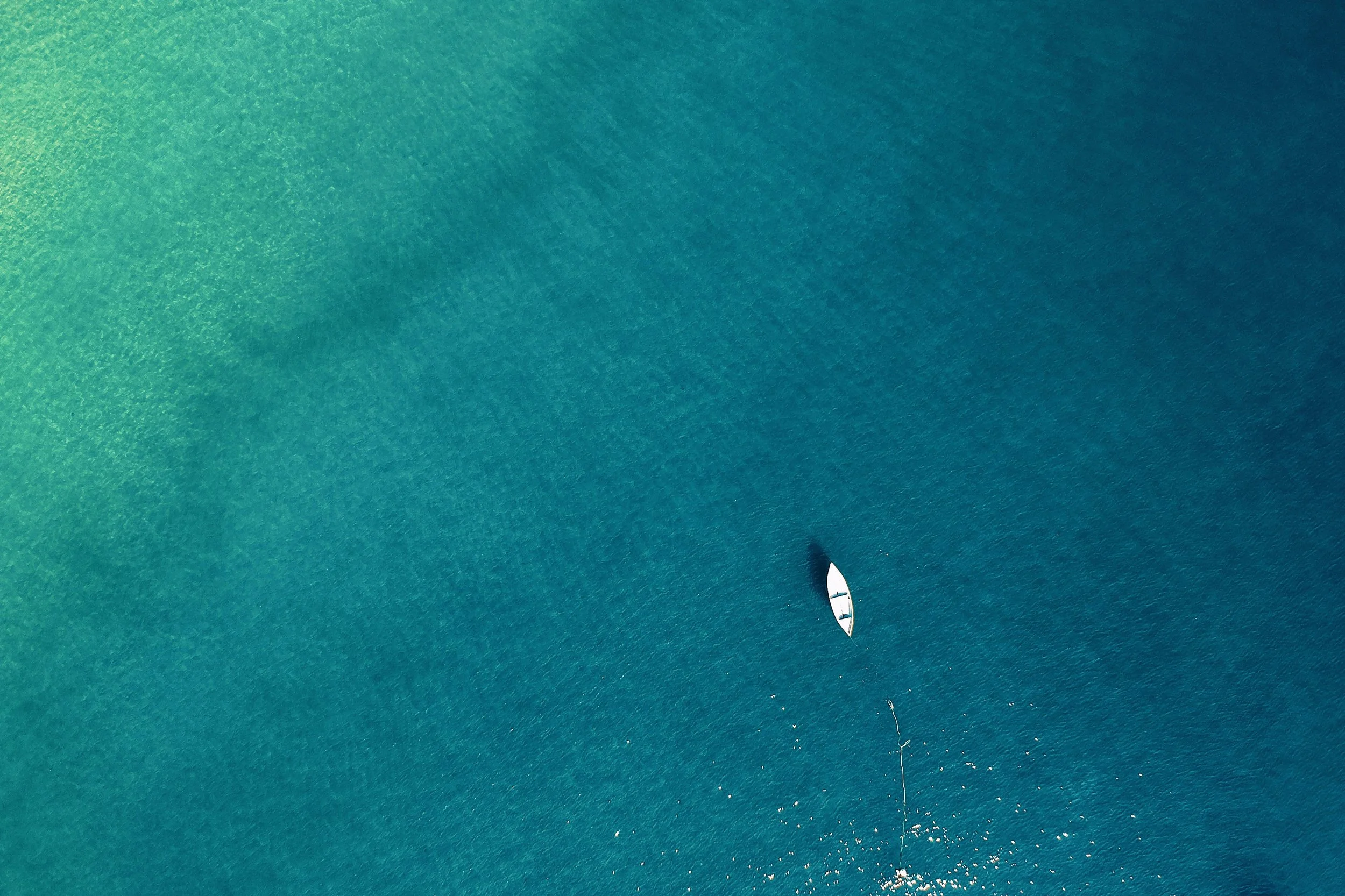
Images
All of Hripa’s images are built around the tagline “Ocean’s Harmony.” This means our visuals are carefully chosen to reflect balance, respect for nature, and the beauty of the sea. Whether it’s a calm horizon, a thriving marine ecosystem, or boats moving effortlessly across the water, every image connects back to our mission of working in harmony with the ocean.


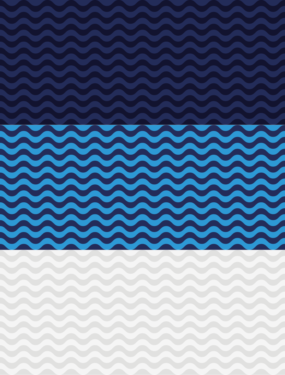
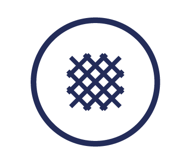
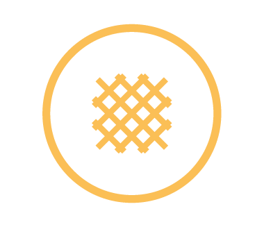
Patterns
The geometric patterns are inspired by the movement of ocean waves, expressed in three different tones drawn from Hripa’s brand colors. This design element captures both the rhythm and depth of the sea, while giving our visual identity a sense of flow and consistency.