
Chilli Rebranding
Chilli's new visual identity, infused with elegance and modernity, reflects the company’s journey toward a design-driven market position and a clear destination for the style-conscious customer.
The Team
Örn Sigurbergsson - Art Direction, Adam Håkansson - Digital Designer, Veronika Ahlin - Photography, Sara Therup - Project Manager, Lars Gustafsson - Client Director, Volodymyr Tarhonskyi - Product Owner
Challenge
Before the rebrand, Chilli and Trademax - both part of the HFN family - felt too similar in look and tone, which made it harder for customers to understand what set them apart. Our challenge was to create a clear distinction between the two brands by repositioning Chilli as the more design-driven, style-conscious option. The aim was to build a visual identity and brand experience that reflected elegance, inspiration, and personality - giving Chilli a confident voice of its own.
The concept
The concept behind Chilli’s new identity was to bring style to the forefront, both visually and emotionally. We built a brand that feels curated, confident, and personal. Clean layouts, elegant typography, and expressive imagery work together to highlight Chilli’s role as a destination for design-oriented customers who want their home to reflect their personality.
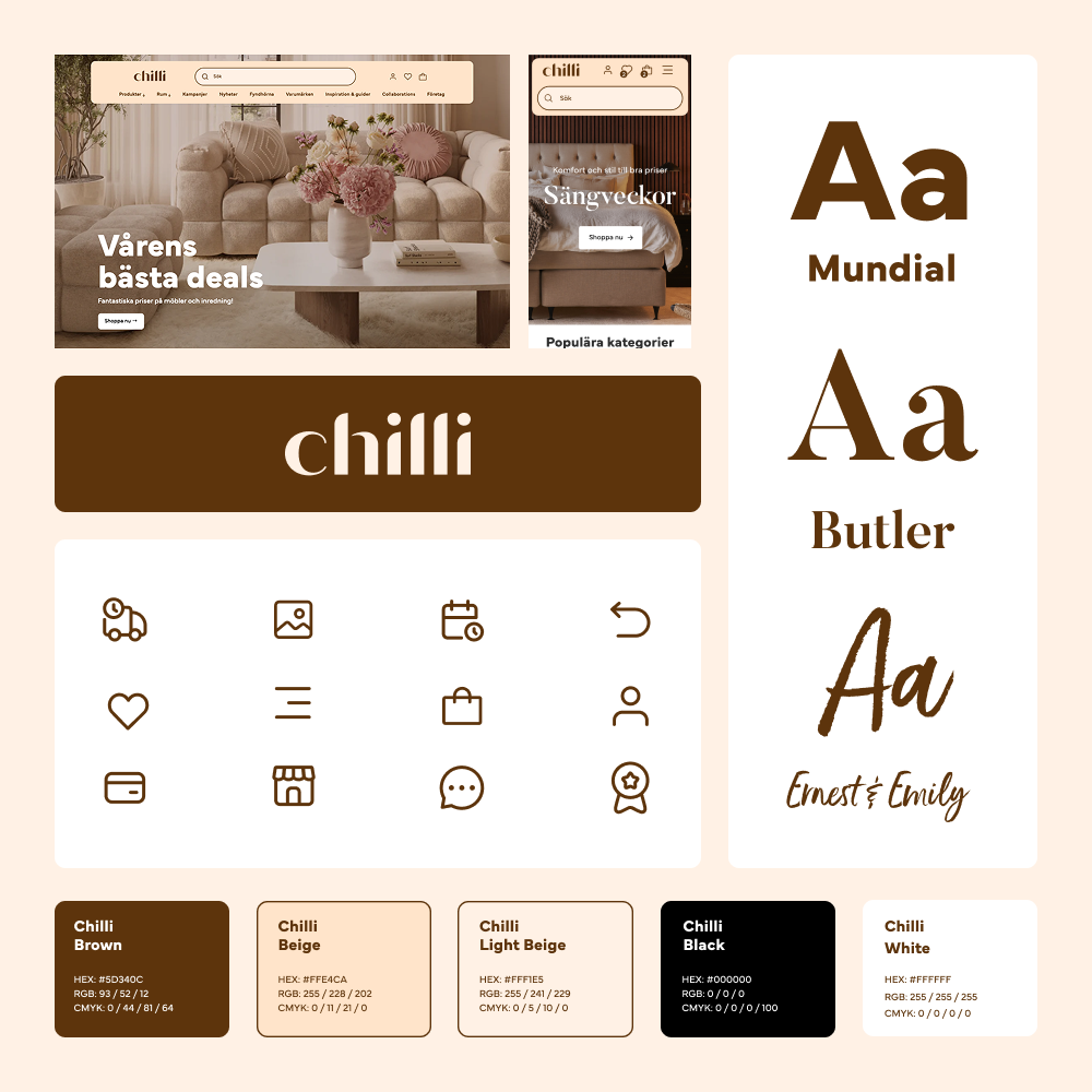
Visual ingredients
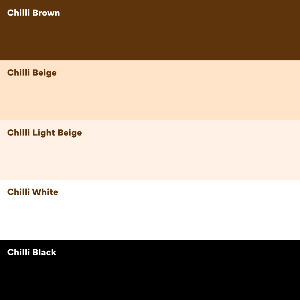
The primary colours are both based on and form the foundation of the brand identity.
Chilli is a brand that aims to convey a sense of home, style, and trend awareness.
Chilli Brown, Chilli Beige, and Chilli Light Beige are neutral colours that can be used in most contexts. At the same time, they convey warmth and give the brand a modern edge. These should be used most frequently, as they are colours that represent Chilli and are unique to the brand.
To meet needs where brown and beige cannot be applied, white and black are also included among the primary colours. These are used in the primary logo as well as on the website, to ensure readability and accessibility.
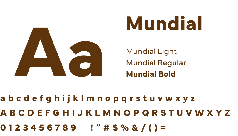
Primary font family
Mundial
Mundial is a geometric sans-serif with a blend of humanist warmth and grotesque precision, offering both approachability and clarity
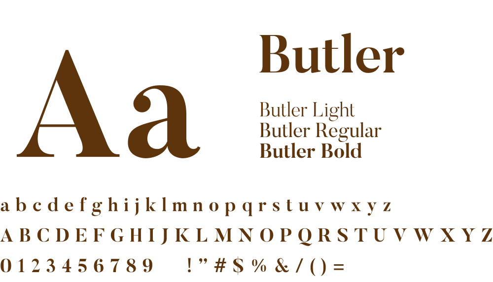
Secondary font family
Butler
Butler is a modernised serif font that combines timeless elegance with a playful twist, thanks to its stencil version. It’s perfect for display use, branding, and editorial design where impact and style matter most.

Display typeface
Ernest and Emily
Ernest and Emily is a charming handwritten script with a playful, all-caps sans-serif style. It’s designed for warmth and personality, making it ideal for branding, packaging, and any design that needs a handwritten, joyful touch
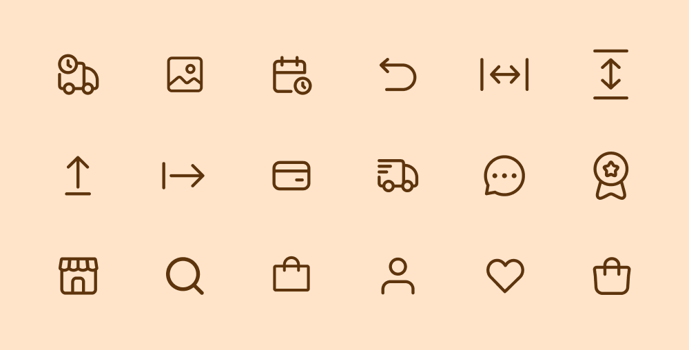
Icons are fundamental to visual branding as they evoke emotions, strengthen messages and significantly influence the audience’s perception and behaviour.

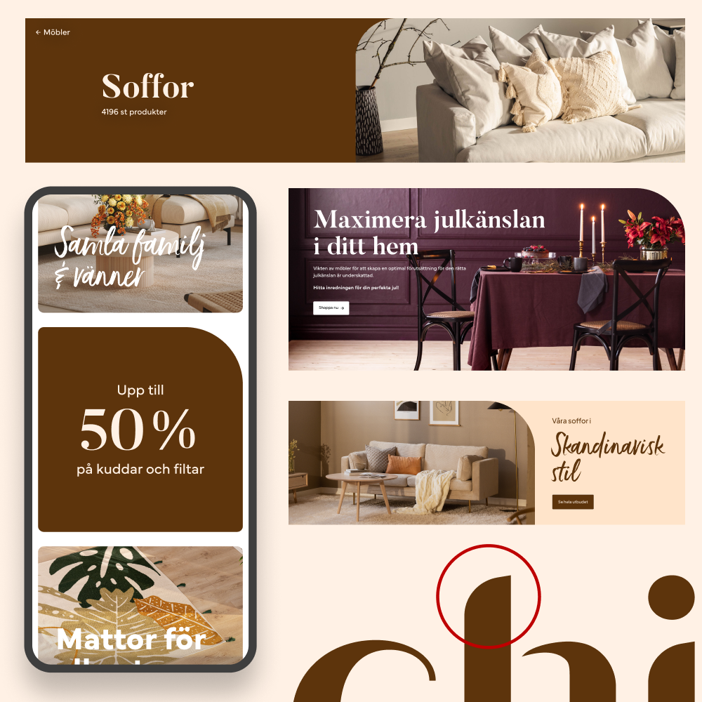
For Chilli, images are at the heart of the brand identity. They don’t just present furniture they evoke a sense of home and make style feel accessible. Strong, consistent photography helps customers picture products in their own spaces, while reinforcing Chilli’s promise of affordable and stylish living.
By defining a clear visual style, the imagery ties together logo, typography, and colour palette, giving the brand a cohesive and recognisable expression in a competitive market.
The Outcome
•
The Outcome •
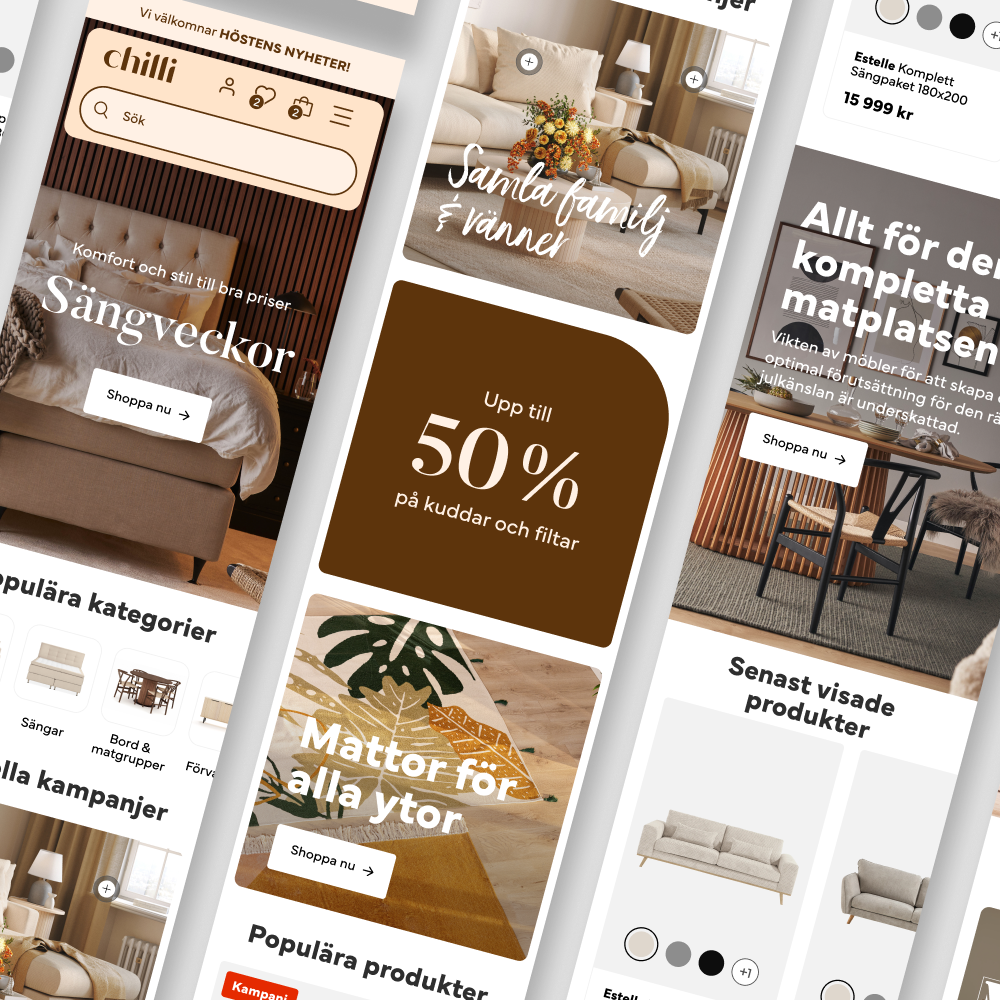
Website

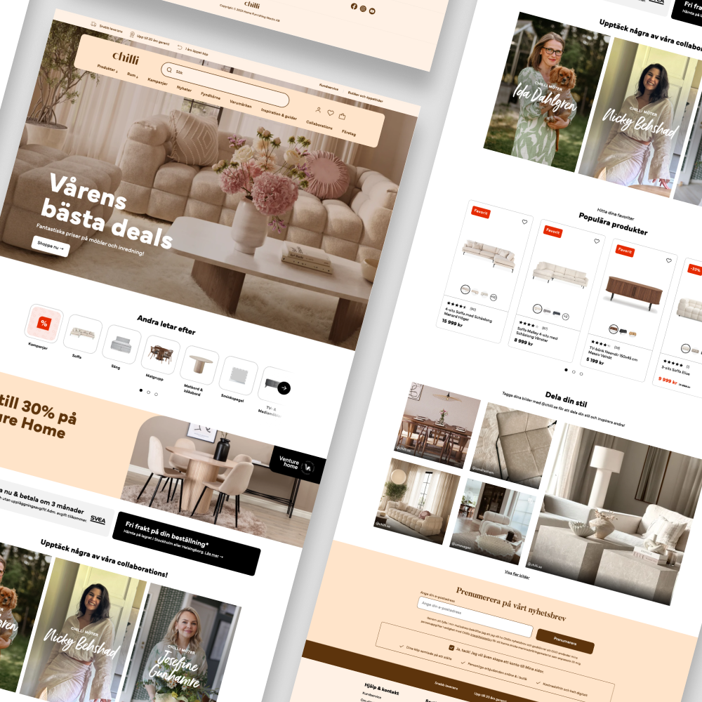


With a passion for style and design, Chilli was ready to take its e-commerce to the next level. The new platform was designed to reflect the brand’s repositioning as a home interior leader, while also enhancing the overall customer experience.