Avensia Rebranding
What began as a simple website refresh evolved into a full rebranding project, as I worked closely with Avensia’s marketing team to upgrade their visual identity.
The Team
Örn Sigurbergsson - Art Direction, Mohammed Raad - Director of Marketing, Jenny Gruvfält - Communication, Ellen Carlsson - Content Creation, Örjan Bergholm - UX Design
Challenge
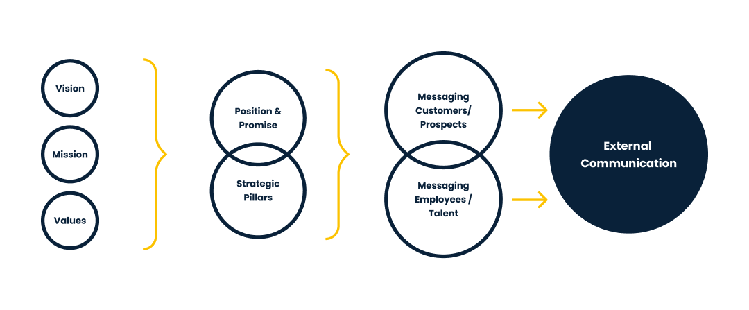
Avensia set out to refine and strengthen their brand to better reflect who they are: a bold, forward-thinking leader in modern commerce. While their mission, vision, and values were well defined internally, their external expression lacked cohesion and clarity. The challenge was to transform this strong foundation into a visual identity and communication system that could consistently represent their personality, purpose, and premium positioning, across every touchpoint, from marketing to internal communication.
This rebranding effort needed to go beyond aesthetics. It required building a scalable, engaging identity rooted in their core belief: that progress is driven by people, powered by technology, and shaped by a relentless drive to win. From the visual language and tone of voice to messaging and motion, every element had to reflect Avensia’s confidence, warmth, and passion, making the brand instantly recognisable and fully aligned with its promise: Growing Winners in Modern Commerce.
The concept
The visual identity was built around the geometric forms found in the Avensia logo, using them as a foundation for a cohesive design system. These shapes informed everything from layout to images and CTA’s, creating a visual language that feels both structured and dynamic.
By extending the logo’s DNA into the broader brand experience, we were able to achieve consistency while allowing room for flexibility and expression.

Visual ingredients
Colours are fundamental to visual branding as they evoke emotions, strengthen messages and significantly influence the audience’s perception and behaviour.
Dark blue, Avensia's main color, embodies trust, professionalism,
and reliability in its visual identity.
Yellow, employed as a vibrant accent colour by Avensia, signifies innovation and optimism, adding energy and warmth to its visual branding.
White, a fundamental element of Avensia's palette, conveys purity and sophistication, lending a sense of clarity and elegance to its visual identity.
Light Grey is mainly used as an alternative to white in cases when we need to create a contrast to a white background.

Primary font family
Poppins
Poppins is a modern font family that works well with Avensia’s overall visual identity.
We use Poppins for all marketing material including our website.

Fallback font family
Avenir
In Microsoft Office products, such as Word, Power Point and Excel, we use the Microsoft font closest to Poppins: Avenir.

Icons serve as a quick, intuitive visual cue that enhances communication and user experience. The Avensia visual identity includes icons from the Google icon library.
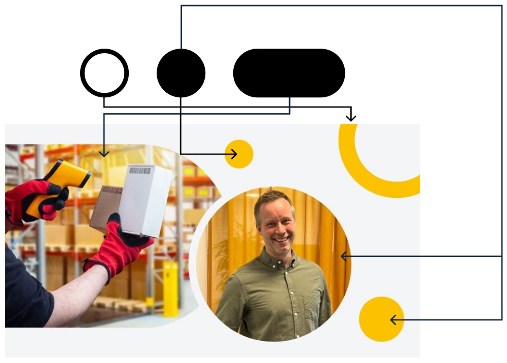
Examples of our photoshoot pictures
The photoshoot images capture the essence of your company’s culture, highlighting collaboration, innovation, and professionalism. By showcasing authentic interactions and a vibrant work environment, they reflect your brand’s core values and foster a deeper connection with both employees and clients, reinforcing the dynamic atmosphere that drives success.

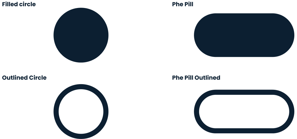
Forms and visual shapes are essential elements of visual branding as they help create a distinct and memorable brand experience. The Avensia visual identity includes a circle and a rounded rectangle (the pill) shape. The rounded shapes are clearly connected to the Avensia logo symbol (the arrow) that has similar rounded edges.
The circular shapes represent our focus on innovation, continuous improvement and longstanding partnerships.
The shapes can be used to hold photos or filled with one of our primary colors. Shapes may overlap or used stand-alone to fill empty space.

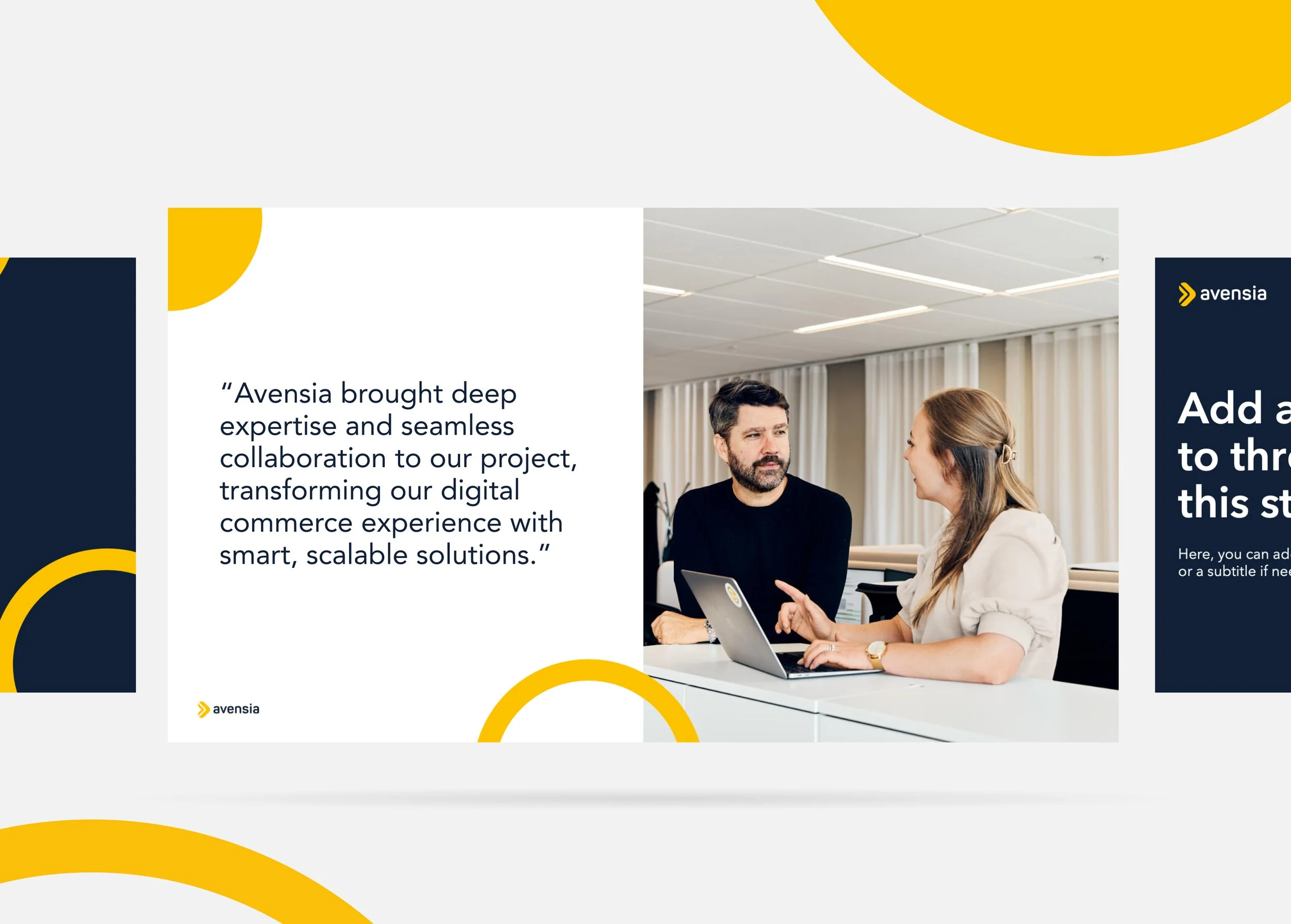
The Outcome
•
The Outcome •
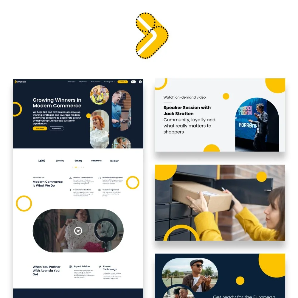
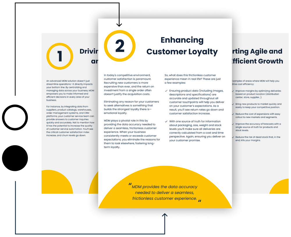
Website
Our collaboration with Avidly on building the Avensia website ensured a seamless blend of strong brand identity and modern digital experience.

Social Media
Consistent social media design strengthens Avensia’s brand identity by making content instantly recognizable and aligned with the company’s voice and values.

Presentations
Well-designed PPT templates ensure brand consistency in every presentation, making Avensia’s identity clear, professional, and recognizable